


This is the fifth post in a series of productivity tips and tricks to help you debug web applications with Firefox Devtools. It shows you 5 tips & tricks for working with the Responsive Design Mode in the Firefox Developer Tools.
This is a series I try to keep up with, I’ve gathered so many tricks over the years. If you’ve liked this or want to see more, I’m @avolakatos on Twitter, follow me there!
I use the Responsive Design Mode as a quick way to test on mobile, locally, without having to deploy. The throttling capabilities, touch events, and custom sizes make it perfect for my needs. I like the fact that I have the rest of the Developer Tools active side-by-side, without having to connect them to my phone browser, and having to look in 2 separate places to debug. It doesn’t work for complex stuff, like pan and zoom, but it’s enough for one finger touch events. Sometimes I use the custom user agent just to see what kind of UA tracking websites do in general. I’m not a fan of the fact that since Firefox 60, automatic reload doesn’t happen for user agent switching or when you enable touch events, but I understand the reasoning behind the feature.
Add custom devices
You can edit the display size in the Responsive Mode of Firefox Developer tools, but if you want to make that a preset you’ll have to add a custom device. You can open the device dropdown, and select “Edit list”. That gives you a list of the most common presets, and you can enable/disable the ones you need. If that’s not enough, you can add your own custom device. If you think the default list should be different, Mozilla is maintaining a GitHub repo for that, feel free to submit a PR.
Throttling
You can throttle the speed of your network requests and see how your website loads on different connections. Firefox has a lot of presets useful for mobile devices, with an intuitive name instead of me having to guess what speed a bad 3G connection would be.
Simulate touch events
You can simulate touch events in the Responsive Design Mode by clicking the little hand icon. It will disable drag-and-drop selection, and enable touch events, including tap and long-tap events. Click events will be turned into tap events and a long-click event will be simulated into a long-tap event, opening the contextual menu.
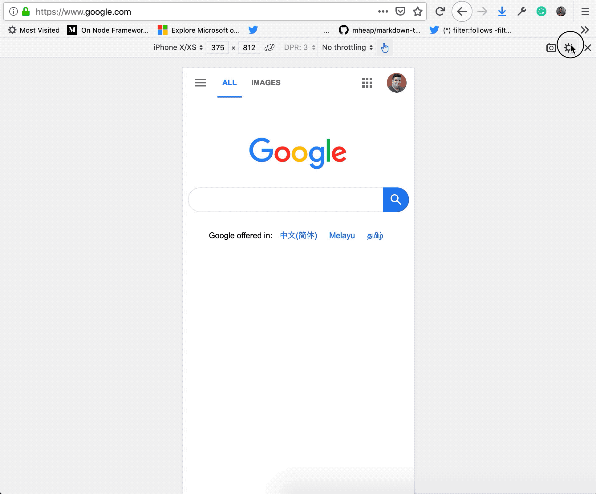
Change user agent
You can change the user agent string from the Responsive Design Mode of Firefox DevTools. You’ll have to go to the Settings icon in the top right corner and enable “Show user agent”, and then you can change it in the input field. I personally like to set the “Reload when user agent is changed” as well because most websites do their user agent detection on load. You can see here how the Google home page changes when it thinks I’m not an iPhone anymore, and I’m the DuckDuckGo crawling bot 😅.
Left align the Viewport
The Responsive Design Mode is centered by default, and that is all good when I’m only testing. But when I’m debugging, I’d like to be able to us as much of the rest of the screen for the DevTools panel. You can make align the Responsive Design Viewport to the left, by enabling the option in the Settings menu.