


I’ve recently moved my personal website to Hugo, and it’s been mostly a pleasant experience switching over from Jekyll. I got tons of improvements in build time. But what didn’t work so well for me was the Hugo documentation. It all relies on the idea that you’ll install Hugo, create a new site, and then add a theme. Here is where the problem starts. I didn’t want a stock theme, it’s my personal website after all, so it should be an expression of myself, right? Well, I was lucky enough to catch Hui Jing in a benevolently, slightly bored, mood. She created all the custom CSS for it, with a fantastic Masonry layout.
But that meant from this point forward the Hugo docs were mostly useless. They are geared towards helping you either develop a theme or change your theme to accomplish something new. Mine wasn’t a very complicated Hugo website, to begin with, so following in Hui Jing’s footsteps, we made it work without docs. Now that the “MVP” has been released for a few months, I keep finding small, little things to improve with it. Or if you look at my web.dev scores, not so little. 😏
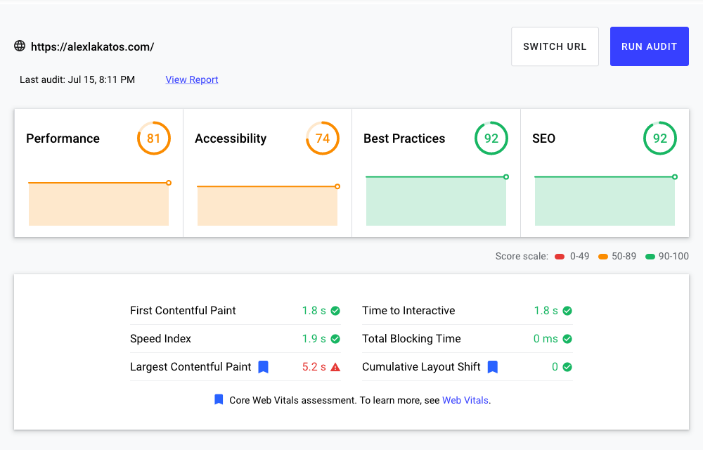
Before
I had my cover image in the post front matter, under the images list, because that was the Hugo way to automatically make that image a Twitter social card as well. Me being lazy, I considered that a win 🤦♂️. I also had my images stored in the static/ folder, because that made sense? I mean images are not exactly content or assets, right? Turns out it’s wrong, but more on that later.
That meant using images in my articles was easy. I write them in markdown, so adding an image was just a matter of putting the right path in there:

For the layouts, that’s where things became tricky. Technically the front matter images are an array, even if it only ever had one element. That meant I had to cycle through those elements when I displayed them on the list layouts. Or get the item at index 0. So the code ended up looking a little messy.
<img class="post-image" src="{{ range .Params.images }}{{ . }}{{ end }}" alt="{{ .Title }}" />
There were a few problems with this approach.
- I was too lazy to bother resizing all the images for the
listlayout, so most of them were quite big and loaded all at once on the home page. Slow was an understatement. - I couldn’t be bothered to resize images multiple times to do responsive images. Ideally 3-4 times. Hence the horrible performance score on Lighthouse.
There seemed to be a light at the end of this tunnel though. Skimming through the docs, it looked like there was something called Image Processing in Hugo, and that was supposed to help fix all my problems. I could resize my images at build time while compressing them and changing the encoding quality. It all sounded like an easy fix for my laziness. Except the docs are a bit on the slim side, and they weren’t really useful for a website without a Hugo theme. I’ve given it a try twice so far with no luck, but it looks like third time is the charm.
How to Add Image Processing to Hugo
The first thing I was doing wrong was the fact that images were in the static folder. Image Processing in Hugo works on Resources, and for it to work, the image has to be either a Page Resource or a Resource. Page Resources have to live in the same folder as the markdown file, so that was out of the question. There were way too many images to move around, and too many paths to change in every article. The other option, Resource, meant the images have to live in the assets folder, so that was an easy drag-and-drop. Didn’t even have to change the relative paths in the articles front matter.
First thing I did was to move my images into the assets folder instead of static. I changed my images to live from /static/img to /assets/img. Which meant my image sources in articles stopped working altogether. The assets don’t get generated at build time unless they’re processed. And even then, their file name is dynamically generated with every build. So I had to change all image occurrences in the articles and templates to use the Resource instead.
For that to work in my content files, I had to create a shortcode, it’s the Hugo way to have snippets inside Markdown. Here’s how mine looks like, I’ve taken the responsive images shortcode Laura Kalbag blogged about and changed it to suit my layout. And because I have animated GIFs in my DevTricks series, I’m not resizing those, just passing the relative permalink to an image tag. I’m also not doing anything to external images. Still, I figured making everything play nicely with alt tags would score me some Lighthouse points.
{{/* get file that matches the filename as specified as src="" in shortcode */}}
{{ $src := resources.GetMatch (.Get "src") }}

{{ if in (.Get "src") "http" }}
<img src="{{$src}}" {{ with .Get "alt" }}alt="{{.}}"{{ else }}alt=""{{ end }}>
{{ else }}
{{ if in (.Get "src") ".gif" }}
<img src="{{$src.RelPermalink}}" {{ with .Get "alt" }}alt="{{.}}"{{ else }}alt=""{{ end }}>
{{ else }}
{{/* set image sizes, these are hardcoded for now */}}

{{ $tinyw := default "500x" }}
{{ $smallw := default "800x" }}
{{ $mediumw := default "1200x" }}

{{/* resize the src image to the given sizes */}}

{{ .Scratch.Set "tiny" ($src.Resize $tinyw) }}
{{ .Scratch.Set "small" ($src.Resize $smallw) }}
{{ .Scratch.Set "medium" ($src.Resize $mediumw) }}

{{/* add the processed images to the scratch */}}

{{ $tiny := .Scratch.Get "tiny" }}
{{ $small := .Scratch.Get "small" }}
{{ $medium := .Scratch.Get "medium" }}
{{ $large := .Scratch.Get "large" }}

{{/* only use images smaller than or equal to the src (original) image size */}}
<img
  {{ with .Get "sizes" }}sizes='{{.}}'
  {{ else }}
  sizes="(min-width: 35em) 720px, 100vw"{{ end }}
  srcset='
  {{ if ge $src.Width "500" }}
    {{ with $tiny.RelPermalink }}{{.}} 500w{{ end }}
  {{ end }}
  {{ if ge $src.Width "800" }}
    {{ with $small.RelPermalink }}, {{.}} 800w{{ end }}
  {{ end }}
  {{ if ge $src.Width "1200" }}
    {{ with $medium.RelPermalink }}, {{.}} 1200w{{ end }}
  {{ end }}'
  {{ if .Get (print $medium) }}
    src="{{ $medium.RelPermalink }}"
  {{ else }}
    src="{{ $src.RelPermalink }}"
  {{ end }}
  {{ with .Get "alt" }}alt="{{.}}"{{ else }}alt=""{{ end }}>
{{ end }}
{{ end }}
To use this image shortcode in my content, I had to change the way my links were called from the default markdown syntax to something in between Hugo and HTML:
{{< img src="img/posts/web/hugo-performance-before.png" alt="Bad Lighthouse Performance" >}}
The output of the {{< img >}} shortcode looks a bit similar to this:
<img sizes="(min-width: 35em) 720px, 100vw" srcset="
/img/posts/web/hugo-performance-before_hu187b84b0088ba519b328cb2126b97350_79974_500x0_resize_lanczos_2.png 500w,
/img/posts/web/hugo-performance-before_hu187b84b0088ba519b328cb2126b97350_79974_800x0_resize_lanczos_2.png 800w,
/img/posts/web/hugo-performance-before_hu187b84b0088ba519b328cb2126b97350_79974_1200x0_resize_lanczos_2.png 1200w"
src="/img/posts/web/hugo-performance-before.png" alt="Bad Lighthouse Performance">
It looked like I could resize my images inside content. So why wouldn’t I be able to do the same in my layouts? Because somewhere in the fine print on the docs it says I can’t use shortcodes outside of content files. Still, the same functionality is available in layout templates via partial templates. As it turns out, I don’t need responsive images on my list views, I just need way smaller images. So I didn’t bother recreating the whole shortcode logic in partial templates. Instead, I had a less complicated, lazier approach. I get the image Resource, I resize it to 360px, with a quality of 85%, using a Box filter. It all translates to smaller, faster, poorer quality images on the home page.
{{ if .Params.images }}

{{ $image := index .Params.images 0 }}
{{ $src := resources.Get $image }}
{{ $small := $src.Resize "360x q85 Box" }}

<img class="post-image" alt="{{ .Title }}" src="{{ $small.RelPermalink }}" >

{{ end }}
After
With these changes, I was ready to test my Lighthouse score again. You can try as well, my website is alexlakatos.com.
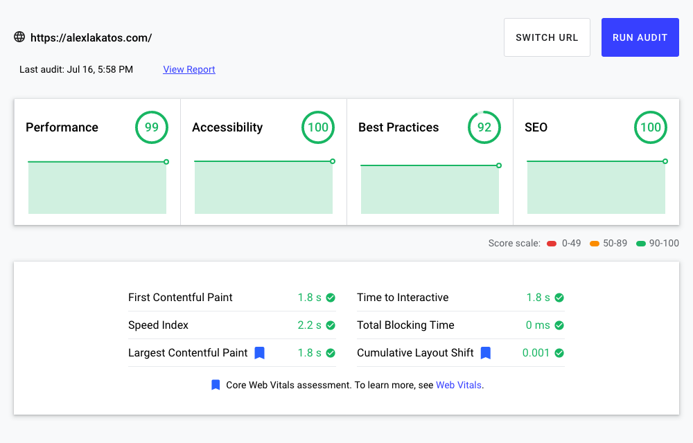
You’ll notice my Largest Contentful Paint went down by about three and a half seconds. I’d call that a win. The Performance score also went up to 99, which I’d call pretty darn good. The fact that both my Accessibility and SEO scores jumped to 100 is because the new shortcode made me re-write all my image tags. I took the time to update them to have an alt attribute, so I wouldn’t have to go through them again.
Now if I wanted to do more, I would have to figure out a way to make Hugo’s Image Processing pipeline work with next-gen image formats. But that’s a story for another time. In the meantime, feel free to reach out on Twitter, and let me know if you’ve found this useful. Or at least mildly entertaining.😅